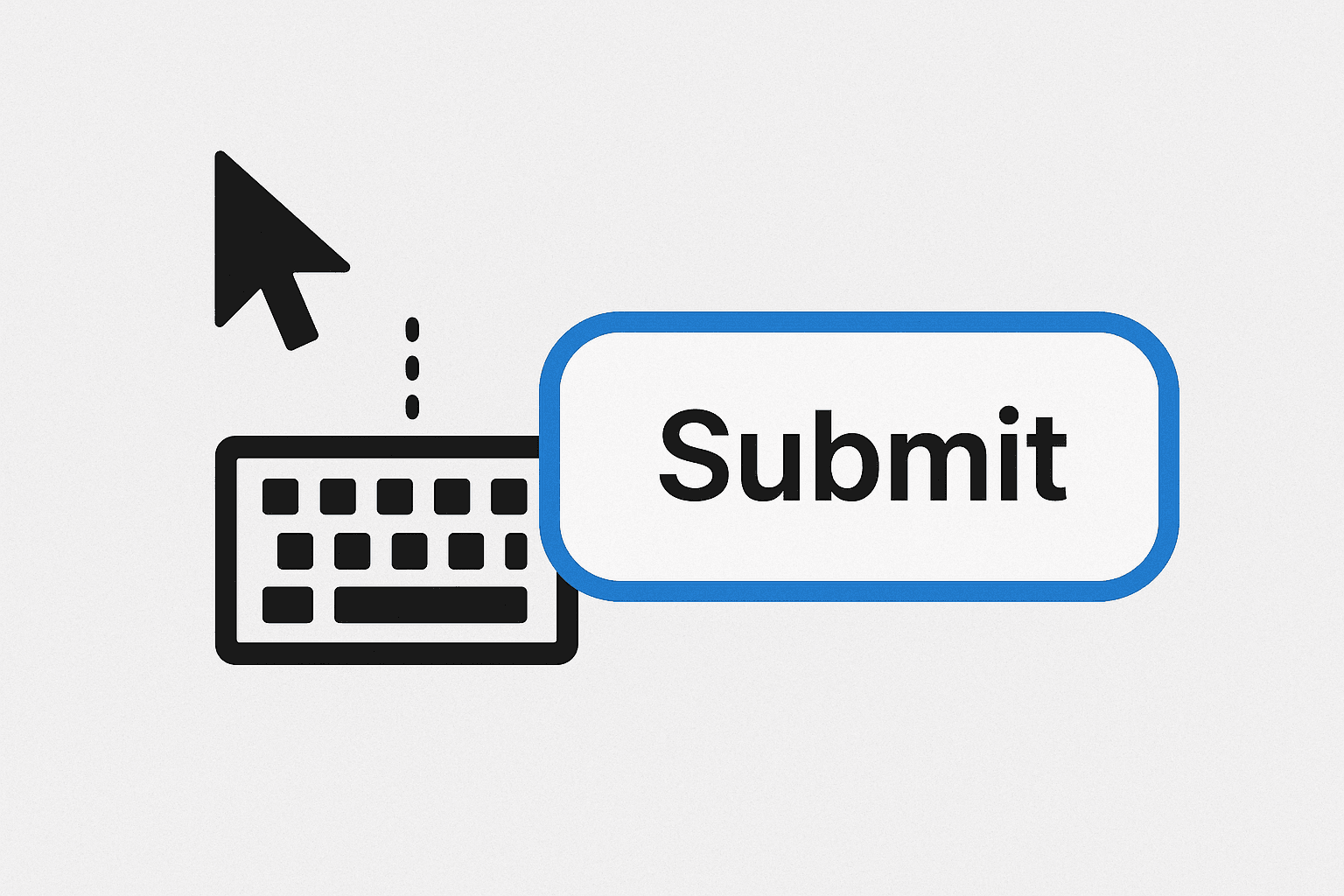
Forms that Work for Everyone (Screen Readers, Labels, Errors)
I am a highly skilled Full Stack Software Engineer (frontend heavy) with a track record of success in the banking/fintech, health-tech, e-commerce, event tech, and CRM industries. With over half a decade of experience, I bring a wealth of experience in development, advocacy, problem-solving and architecture design.
TLDR;
If you're building for the web and your forms don't work for everyone, they simply do not work. Designing forms to be inclusive is foundational for good UX and accessibility, and not just a nice-to-have feature.
Most of the time, we treat forms as a mere visual task. What do I mean?
We align fields nicely, slap a button on the end, and maybe even throw in a toast message for submission warnings/errors. But then we fail to think about users who navigate the web with screen readers or with just the keyboard. And even for most parts, we forget about the cognitive load*, or error recovery* of our users?
In this article, we’ll explore how to create forms that work for everyone, whether they use screen readers, assistive devices, or just keyboard navigation.
What we'll cover:
Semantic HTML and structure.
The role of labels and descriptions.
Managing focus and keyboard flows.
Accessible error handling.
Live regions, validation feedback, and assistive technology considerations.
Now, let’s get right to it! 😉
Use the Right Semantic HTML Always
Always start with a solid base: HTML. I don’t even know how you’d want to survive without that! 😅
Avoid throwing in the div element all over the place. Do your best to use the right elements designed for form controls all the time.
For instance;
Instead of
<div>
  <div>Email address</div>
  <input name="email" required />
  <button onclick="clickHandler()">Subscribe</button>
</div>
Why not do?
<form onsubmit="handleSubmit(event)">
  <label for="email">Email address</label>
  <input id="email" type="email" name="email" required />
  <button type="submit">Subscribe</button>
</form>
Why does this matter?
<label>explicitly ties text to an input.<input>is natively focusable and announced by screen readers.<button>has default keyboard interaction (Enter/Space), unlike a div.
Labels Are Non-Negotiable, Use Them!
Every input needs a visible and accessible label. Not just a placeholder text, and definitely not just ARIA attributes. A real, on-screen label.
For instance;
Instead of
<input type="tel" placeholder="Phone number" />
Why not do?
<label for="phone">Phone number</label>
<input id="phone" type="tel" />
This is because, Placeholders;
disappear on focus,
are hard to read with low contrast,
are not announced as labels by many screen readers, and many more!
If there’s any reason at all that’d make you want to use just placeholders for your inputs, for instance when the visual space is tight, then I suggest you consider other more intuitive ways of displaying your form labels. For example, you could consider using floating labels (like can be seen in MUI’s text field).
In all, always use a proper <label> under the hood.
Grouping and Context in Forms: fieldset vs legend
When you have related fields in your forms, like address, gender, or payment info, it’s always good practice to wrap them in a <fieldset> with a <legend>.
For instance;
<fieldset>
  <legend>Payment Method</legend>

  <label>
    <input type="radio" name="payment" value="card" />
    Credit Card
  </label>

  <label>
    <input type="radio" name="payment" value="paypal" />
    PayPal
  </label>
</fieldset>
This way, screen readers will announce the legend as context before reading out each input. This helps build comprehension, especially for users navigating by audio, and makes the user experience worthwhile.
Keyboard Navigation and Focus Management
The order in which users navigate through form elements using the Tab key is very important for ensuring a smooth and intuitive experience. When designing forms, it's necessary to structure them so that the tab order follows a logical progression that mirrors the visual layout. This means arranging input fields, buttons, and other interactive elements in a sequence that users would naturally follow, thus allowing users to move efficiently from one part of the form to another without unnecessary jumps or confusion.
To achieve this, ensure that all interactive elements are included in the tabbing sequence and that the focus moves in a sensible direction, typically top to bottom and left to right (or right to left, as the case may be). Use HTML to properly arrange elements in the DOM, and avoid using CSS alone to change the visual order, as it can disrupt the natural tab flow. Additionally, use the tabindex attribute to control the focus order without overriding the default flow unless absolutely necessary.
Users who rely on keyboards should be able to move through the form linearly using Tab, Shift + Tab, Enter, and Space.
Do NOT remove
outlinestyles with CSS. If you must style them, replace them meaningfully.Avoid
tabindex="0"on non-focusable elements unless necessary.Never use
tabindexto "fake" tab order. It often breaks assistive technology.
If you're building custom modals/dialogs/popups or dynamically-injected fields:
Always trap focus within modals. Do not allow items outside of the modal to be focused on while the modal is still open and active.
Return focus to the trigger (modal opener) when the modal closes.
Auto-focus the first input responsibly.
Handling Errors Accessibly
Visual Feedback Isn't Enough
Red borders and inline error messages are helpful for sighted (and non-color blind) users, but not for screen reader users. We need to go further.
Use aria-describedby to associate error text with the input.
<label for="username">Username</label>
<input id="username" name="username" aria-describedby="username-error" required />
<p id="username-error" class="error">Username is required</p>
Screen readers will now announce the error message alongside the field when focus lands on it.
Use Clear Language
Avoid vague errors like:
"Invalid input"
"Something went wrong"
Instead, use:
"Username must be at least 6 characters"
"Email address is required"
Always be specific and human in your feedback. This way, your users get to easily understand what they’re doing wrong.
Live Validation Feedback (with ARIA)
If you're validating fields on input or blur, notify users using ARIA live regions.
<div id="password-feedback" role="alert" aria-live="assertive"></div>
Update this region dynamically when the validation state changes. This ensures that screen readers announce the changes as soon as they occur.
Also, while live regions are very useful, avoid overusing them as they can become noisy and overwhelming. Use them only when information must be passed across to the users in real time.
Handling Custom Components
If you’re building your own form elements (eg; select dropdowns, date pickers, toggles, etc), you take on the responsibility of replicating all native behaviors.
For example:
A custom select should be operable via keyboard
It should announce expanded/collapsed state
It must be focusable and labeled correctly
This is not as easy as it looks. So, if you can, make use of native elements. Else, if you must go custom, then you need to study the WAI-ARIA (Web Accessibility Initiative - Accessible Rich Internet Applications) Authoring Practices Guide here: https://www.w3.org/WAI/ARIA/apg/
Do not Guess. Test with Screen Readers :)
The truth is that you’d never have any idea how your form behaves for 10 to 20% of your users if you’ve not tested your form with a screen reader.
You should try these out for a start:
VoiceOver (Mac users): ⌘ + F5
NVDA screen reading software (Windows users): Free, powerful, open-source
JAWS screen reading software (Windows users): Industry-standard
Chrome VoX extension (in-browser): Voice recognition tool for dictation
Go through your form and answer these questions:
Can you tell what each field is for?
Can you hear error messages?
Does it follow logical order?
When you do this, you’ll most likely spot UX bugs that sighted users will never report.
In Conclusion
It's very important for us to note that accessibility isn’t just about compliance. It’s about building with empathy and respect for the people behind the screens. When your forms work for everyone, your product becomes more usable, more inclusive, and ultimately more successful and useful.
A form isn’t complete when it looks right. It’s only complete when it feels right for every user, on every device, and in every context.
Let’s build better and more accessible UIs!
References & Further Reading
MUI Text Field (example of floating label)
* Cognitive load refers to the amount of mental effort being used in the working memory. When designing forms, it's crucial to consider how much information and how many tasks we are asking users to process at once. If a form is too complex or asks for too much information at once, it can overwhelm users, especially those with cognitive disabilities or those who are unfamiliar with the content. By paying attention to cognitive load, we can create forms that are not only more accessible but also more user-friendly for everyone.
* Error recovery is an essential aspect of form design that ensures users can easily correct mistakes and complete their tasks without frustration. When a user encounters an error, the form should clearly indicate what went wrong and provide guidance on how to fix it via error messages displayed near the field where the error occurred. Effective error recovery means creating a supportive and inclusive environment where all users, regardless of their abilities, can complete forms successfully and with ease.